Charlie Bradley A2 Media
Tuesday, 14 March 2017
Comment to the Moderator
Hello Moderator
This is my A2 blog and in total, I have 63 posts. There are 50 research & planning posts as I have uploaded multiple drafts of m production. I have tried to clearly signpost my research and planning and create a good account of my journey and developing skills.
Friday, 10 March 2017
Q1. In what was does your media product use, develop or challenge forms and convention of real media productions?
This establishing shot shows our star image Morgan and Brooke walking into camera this is a convention found within this style of music video, as it shows the star image from the get go. The stars name then appears on the screen this helps for the audience to know what and who they are watching.
This side angle, two person shot shows both of the characters within the music video walking together, this shows the characters are together. This shot completely breaks the conventions of a Indie- Rock music videos as the surrounding environment is rural and unlike the usual theme of a rough urban theme.
These two shots are point of view shots from each other (Morgan and Brooke), we use continuity editing here as they both are shown in previous shots walking together and here using the same rural environment are shown to be facing each other. We use the Genre theorist Ryall who believed 'genre provides a framework' as we make our frame work using unconventional mise en scene.
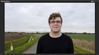
We created this shot using a blue screen, this was the done to create a background that we wanted and also this helped to develop our skills within the Final Cut Pro X, the background is shown to be a dark red as at this stage of the video he is quite angry and confused about the relationship he is in with Brooke.
This shot is showing a completely opposite side to there relationship, as Morgan is shown over Brooke's shoulder and the facial expressions are completely different, this shot is a conventional shot that is usually found within music videos. The shot also leaves a level of mystery as we only see one side of the image, as shown in previous shots of the music video we see both sides of the story at this point we only see the positive side of Morgan.
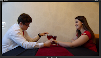
These two shots are side angle shots of the couple on a date, the conventional colours of red and white and even black are shown here, this helps to create the star image Morgan as a romantic younger figure, the same is shown with Brooke as she is presented in red which is colour of love and passion, but the colour red which is shown throughout these frames also shows the other side of the relationship with danger.
Here we again use the blue screen, this is to present Morgan during the 'Up, up and away' lyrics of the song as the balloons represent the lyrics. We present the balloons on the blue screen using the Luma and Chroma keys.
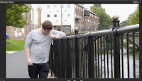
These two shots link together as they show as close and loving relationship in one (left) and a very lonely one (right). They link perfectly as they show how that its about the Dominantly Brooke's side determines the 'happiness' of the relationship. (Right) This shot is frame with Morgan on the right as we wanted to see the calm surroundings he is found in as he is alone and but calm.
This shot shows Morgan and Brooke in the kitchen, there is enigma created here as the gift is eventually rejected by Brooke this uses on of Barthes codes. This is one of the scenes we use to create one of Neale's theories 'Repetition and difference' as we show in this scene a rejection and a 'Mardy Bum' in Brooke.
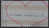
These two shots are created using shot reverse shot to show how differently both of the stars feel and think with in the video. Also this is the first time within the video you see a not as romantic and thoughtful side of Morgan, and this starts to make the audience sympathise with Brooke as she is totally forgotten and another 'thing' takes her place. This stereotypes a typical boy, using Perkins this shows that he forgot Brooke and just thinks about sports.
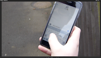
We again use shot reverse shot with seeing the text sent and receive by the couple, (Right) This shot uses a over the shoulder angle to make it a more real camera angle, Ken Burns is used here to zoom to make the text visible on the right, is also highlights what is said and make it centre frame.
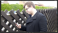
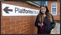
These images are from the previous scene but don't show the phone screen, this helps the continuity editing of the music video as it shows multiple angles of what was happening at the time.
This shot shows the strong independence that Brooke's shows and represents throughout the video, the video goes against the stereotypes of the woman as she storms of and drives away.
This over the shoulder shot is short but effective as it shows the journey away Brooke makes from Morgan and also helps continuity as it makes the scene complete as she travels away.
This shot uses Neale's 'Repetition and difference' as it uses Repetition of the same interior background and clothing, but the outcome of the gift giving from Morgan is positive this time as she takes the bear and is shown with a happy expression.
This Symbolic shot ends the video and leaves a level of your own interpretation to decide what happens, the video ends with the flames of the candles being blown out. This symbolically shows the flames of there relationship going out and the use of diegetic sound allows the audience to hear the breath that extinguishes it.


Q2. How effective is the combination of your main product and ancillary texts?
Throughout the creating the Main Product and Ancillaries we have always had the idea of keeping good synergy between all products. This is from the font used, to the font colour all the way to who is presented on the front of the products, this makes all the products easily noticeable that they all come from the same place.
With the idea of Synergy we have chosen to keep a orange font colour for the poster and the front of the digipack, this was with the idea to keep all the recognisable and easily visible parts of the ancillaries the same colour so you instantly think that its Morgan.
Here again we use the orange against a black ground to make the orange stand out and be clear for the audience. Also the use of the other media outlets such as 'Spotify' and 'iTunes' helps to make the ancillary standout as they are well known pieces of media.
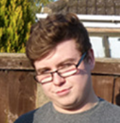
Here we use Morgan the star image as the front of both out Ancillaries and Music video this is due to him being the star, and seeing him should just automatically mean to the audience that it is a piece of his work on display.
All of these are found on the poster these are presented in maroon and black font colour as they are 'sub headings' rather than the large orange recognisable headings, this helps to make difference between importance of information upon the Ancillaries.
Q3. What have you learned from your audience feedback?
Questionnaires
In order to gain good feedback and response me and my partner created multiple questionnaires throughout the process from the start to end, this was done to always keep on top and in favour of our audience. The questionnaire allowed us to gain feedback and data for me and my partner to analyse, this helped us to make vital decisions that would improve anything from the preferred camera angle on the video to the colour of our font.
Focus Groups
The focus groups helped also hugely as it allowed us to communicate on a personal level to various different people from just anyone to a more defined target audience. Our focus group was conducted in October this was to find out basic information and what people prefer, from the colour of clothes for mine en scene to us explaining ideas and getting feedback and recommendations on them.
Reviewing The Overall Package (Music Video, Digipack and Poster)
Me and my partner created this further questionnaire to ask a range questions about how our target audience feel about all the different pieces we have created and how they all fit together. This questionnaire also has helped use to have a complete review from piers and our target audience that will help use really know if they understand what we have created.
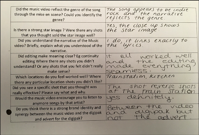
Q1- Did the music video reflect the genre of the song through miss en scene? Could you identify the genre?
No- it's quite a indie song. Upon Reflection, I could have used more subdued colours and altered organ's. However, i think the more vibrant lively colours worked well. Its quite a happy fast paced song and I feel the rise en scene did reflect this.
Yes
- Well acted
- Narrative reflects genre
Overall I was pleased with the results as 11/12 people felt our music video did meet the genre.
Q2- Is there a strong star image? Were there any shots that you thought sold the star image well?
Yes
- Close ups clearly show the star
- I like the beginning
No not really (Only 3 negative responses)
Overall, this was a good review and implies I created a strong image that worked well overall and gives me confidence with our decisions.
Q3- Did you understand the narrative of the music video? briefly, explain what you understood of the narrative.
Yes
- it was a couple breaking up.
- Morgan's girlfriend is marry
- It links to the lyrics
- Morgan trying to make it work
This is a super result and suggests our narrative was a successful feature of the music video.
I also asked about synergy and most people believed that there was a strong brand identity.
The impact that TA research has had on my production is huge as it gives me another view or multiple other view points of my work or thinking, this allows me to make the productions constantly better as I can have a multiple different people look and review my work and they all give different feedback.
Thursday, 9 March 2017
Q4. How did you use media technologies in the construction and research, planning and evaluation stages?
Research and Planning
I next had to research Band websites this was very helpful to find specific colours that go well with the genre and the websites are also great places to find first hand information that can benefit the whole process. I researched The Artic Monkeys website which helped me to find a certain style to adhere to as it made them individual to the rest.
Print media
Magazines were also a large part of my research as it allowed me to find out certain codes and conventions I should stick to or miss out to when making my ancillaries, to make them to a more higher standard I defined my research to my specific genre which allowed me to produce a even better genre specific ancillaries.
Digipacks also provided me with important research as it increased my knowledge of the different styles of digipacks, this was very needed as we needed to create are own for our music and the use of genre specific Digipack research this helped me to make a even better Digipack.
Another Technology was Prezi's this was a creative way of presenting my idea's and research, and also a interactive way as you go through the Prezi in a very individual way compared to other technologies.
The Camera was huge in the different processes as it allowed me to create and research, all the pictures taken throughout will of been taken on a camera this helped me to create a high standard of these processes. Principle Photography helped to create a idea of what I wanted to make as it allowed my ideas to run free of what I could do with the space there was.
Blogger
Blogger was the main piece of technology used throughout the Research and Planning as it allowed me to do various different things that would benefit me in improving my research and what I find.
The Technology that I used the most within the these phases was Blogger, the reason Blogger has been used so much is due to how familiar I am to the technology, and through this it allows my research to be to a high standard. .Blogger was and is still the place where I put all my research and information I find to do with the music video making process. This platform allowed me to efficiently present it in a clear and well presented way that also was easily accessible to all the needed people that could advise and help me through out the process. With blogger the comment section also has helped me to keep a high standard of work up as it allows me to get quick advise on how to improve and what to add within certain blog posts. Due to blogger being so clear and simple to use it allowed me to easily review previous posts and use them for inspiration in the future for new ideas and posts on blogger.
The Technology that I used the most within the these phases was Blogger, the reason Blogger has been used so much is due to how familiar I am to the technology, and through this it allows my research to be to a high standard. .Blogger was and is still the place where I put all my research and information I find to do with the music video making process. This platform allowed me to efficiently present it in a clear and well presented way that also was easily accessible to all the needed people that could advise and help me through out the process. With blogger the comment section also has helped me to keep a high standard of work up as it allows me to get quick advise on how to improve and what to add within certain blog posts. Due to blogger being so clear and simple to use it allowed me to easily review previous posts and use them for inspiration in the future for new ideas and posts on blogger.
Camera
The camera in this stage of the process was a very small part of the research and planning as it was only used on certain occasions, such as the principle photography stage which really helped as it allowed me and my partner to get a clear idea on areas and spaces we could use and create our music video within. Principle photography was also used in the seeing what our actors look like and this also became extremely helpful as it allowed us to get a good idea of outfits and make up our actors. \
Youtube
Youtube was probably the most useful for gaining inspiration and research as it allowed me and my partner to really have a good look at all the possible different styles of music videos, and how to make ours look more professional. When researching using Youtube it was easy to navigate as it is a popular website that I used very often so the accessibility of the website was clear and allowed use to gain extra time else where. YouTube allowed me to find good high standard music videos that I would be able to take inspiration from. YouTube is becoming a huge social platform that is used for any video to be spread virally, but more importantly is used to show music videos. The ease of YouTube also was a contributing factor so I could find 100,000 of music videos in seconds and define these to find my specific genre.
Through previous tasks we created a video and uploaded it to Youtube so the experience gained from that use, allowed me and my partner to get straight on with no confusion.
Iphone
Even though it was used in such a small way, the importance of it was clear. I used my iPhone to record various things like a focus group and also it was used for research as Youtube was easily accessible on it.
Google
A huge piece of technology that was really looked over during this whole process was Google, this was easily the most used as it was the search engine used to search all these other websites and it allowed a quick easily accessible process. Without Google i would of been unable to find my chosen artist as I used it for basic research at the beginning as it allowed me to get a wide range of ideas.I next had to research Band websites this was very helpful to find specific colours that go well with the genre and the websites are also great places to find first hand information that can benefit the whole process. I researched The Artic Monkeys website which helped me to find a certain style to adhere to as it made them individual to the rest.
Print media
Magazines were also a large part of my research as it allowed me to find out certain codes and conventions I should stick to or miss out to when making my ancillaries, to make them to a more higher standard I defined my research to my specific genre which allowed me to produce a even better genre specific ancillaries.
Digipacks also provided me with important research as it increased my knowledge of the different styles of digipacks, this was very needed as we needed to create are own for our music and the use of genre specific Digipack research this helped me to make a even better Digipack.
Another Technology was Prezi's this was a creative way of presenting my idea's and research, and also a interactive way as you go through the Prezi in a very individual way compared to other technologies.
The Camera was huge in the different processes as it allowed me to create and research, all the pictures taken throughout will of been taken on a camera this helped me to create a high standard of these processes. Principle Photography helped to create a idea of what I wanted to make as it allowed my ideas to run free of what I could do with the space there was.
Construction
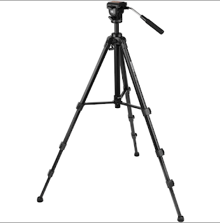
The main components within creating and constructing my music video was the Camera, Tripod and Memory Card. The reason i highlight these as the most important is with out them none of the video would of been able to of been produced. The camera was used to film the video to a high standard and due to the camera being very good it allowed the filming process to be simple and we could rely on the quality of the camera. The Tripod was just as important as it allowed are shots to be stable and to a correct hight and distance. The memory card was a crucial part also as it allowed us to save and store all of our clips ready for editing safely and easily accessible.

The editing of the music video was all done on Final Cut Pro X, this was due to the software being very easy to use when you have practised and also a professional standard piece of equipment that will only make what ever you want better, when used the correct way. The Software when first given to me I found was hard to master and understand due to all the complicated different aspects of the software.
The tools within Final Cut Pro X all had there separate uses and all had there way of improving what was making, mostly all of the tools within the software was used in creating my music video.
The use of Final Cut Pro X allowed me to quickly and effieiently create my music video as the tools were after some time easy to use and through this it really developed my skills upon software like this (editing software). One of the main tools used was the blade tool as it allowed me to change the size of the clip to the desirable size so that the clip will make sense, and fit in with what I was trying to create. The Ken Burns tool was also used to good effect in my music video as it zoomed the camera in to a certain area of the frame slightly, this worked well as it highlighted/ magnified that specific area of the frame.
Adobe Elements 11 was another massive piece of software I and my partner used to create our digipack and poster, this software was much easy to use for us, as we had a previous year working on it. This really played into our hand as we could just put our heads down and get on with the task.
Evaluation
During the evaluation stage of the process I used blogger to upload and log all my work and evaluations as it is easily seen and able to be reviewed and given feedback for. Blogger also has all the information and my previous work on it so it was easy so I could back track on previous work. Also with using blogger I can present the evaluation in what ever way I want, to make it the most appealing as I can possibly do so. With using blogger it is apiece of software which is most like Word this helped me as it allowed me to add photos and there extras again to make the posts more appealing.
Thinglink
I have chosen to use thinglink here as it allows me to compare and evaluate all my ancillary tasks.
Subscribe to:
Comments (Atom)


